Light space
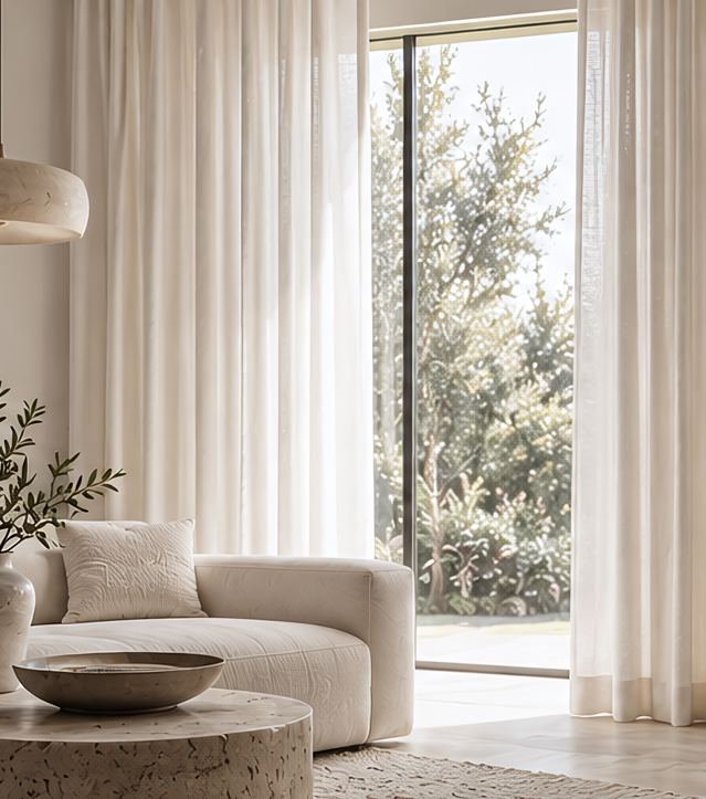
Keep it light
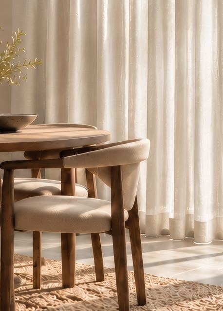
Soft whites and creams maintain an airy, open feeling.
ChooseWhite / Cream
Curtains chosen by colour. Four palettes, four finishes, made to measure by Homekaara.
Start with the feeling you want in the room. Choose a colour story above to see its palette, the spaces it suits and every design in it.
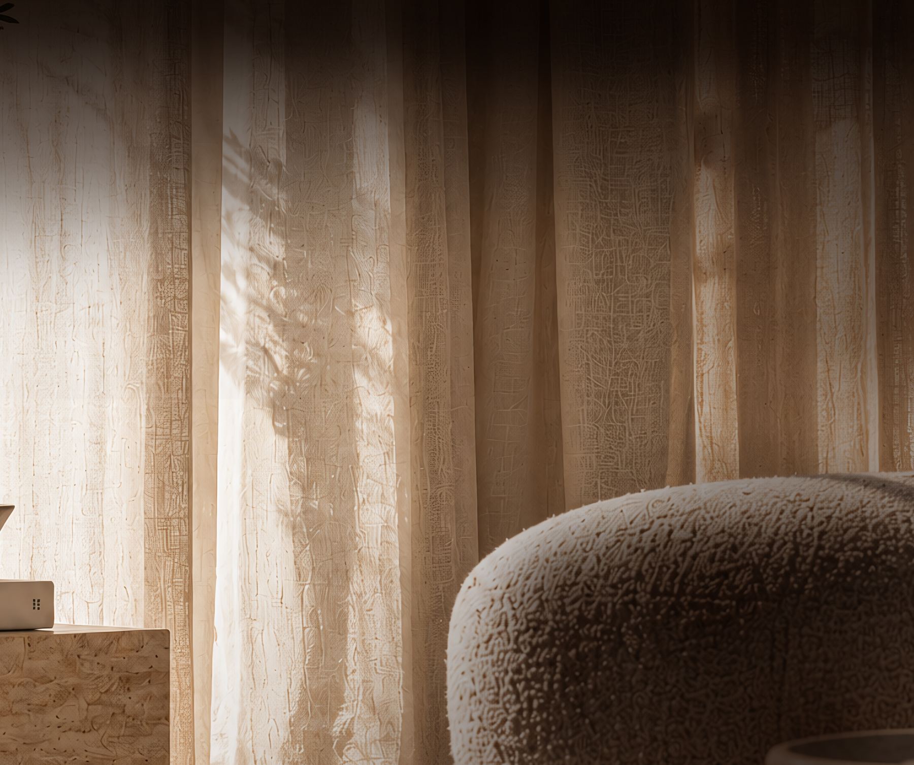
What if less was more?
Less is more when you want the curtain to recede, letting light, architecture and furniture take the lead.
Catalogue 01
Quiet
Warm
Timeless
White, beige and cream soften a room without competing with it. Use them when you want the space to feel open, calm and considered.
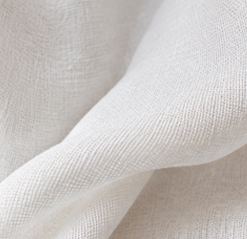 White
White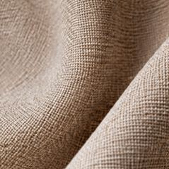 Beige
Beige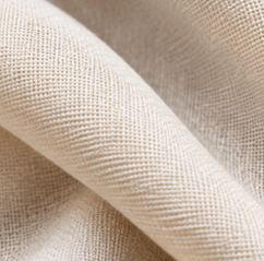 Cream
CreamA palette that lets everything else speak.
A great curtain doesn't stand alone. It works with what's already in your space: your walls, floors, furniture and light.
Soft whites and creams maintain an airy, open feeling.
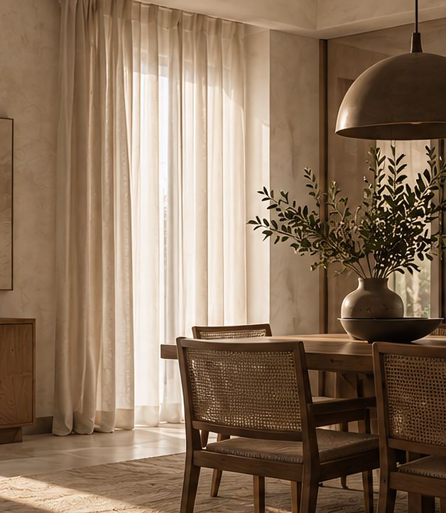
Creams and warmer beiges make the room feel cohesive.
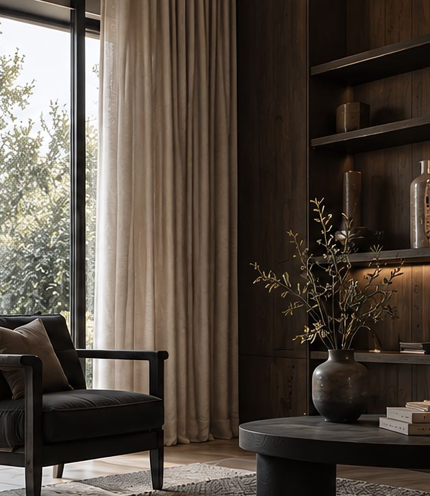
Deeper beiges and earthy neutrals help balance stronger elements.
The fabric changes everything around it. The same colour can feel softer, richer, quieter or more luminous.
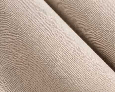
A matte finish absorbs light, keeping colour soft and understated. The result feels relaxed and natural.
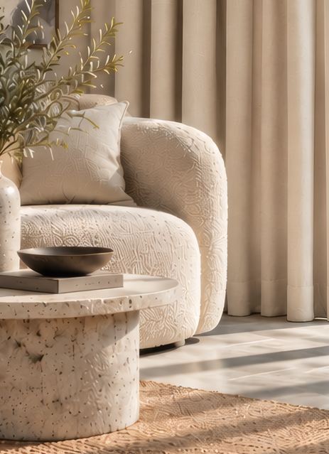 Quiet / grounded
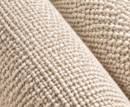
Texture gives colour more depth. It catches light unevenly, making the same tone feel layered and tactile.
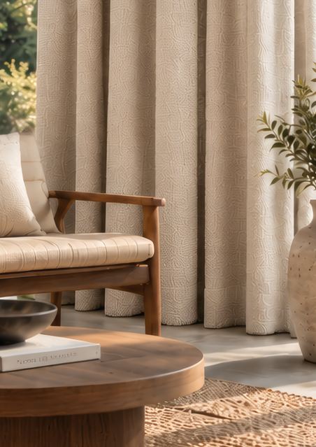 Natural / rich
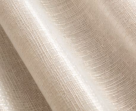
A subtle sheen catches the light, giving colour a gentle glow and a more polished feel.
 Luminous / refined
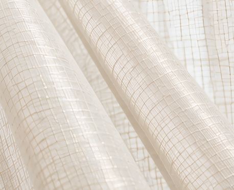
A sheer fabric lets light pass through the colour, making it feel lighter, softer and more delicate.
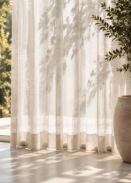 Delicate / airy
The right neutral doesn't compete.
It belongs.
115 designs across 6 colours. Open a colour, then pick a design to see its details.
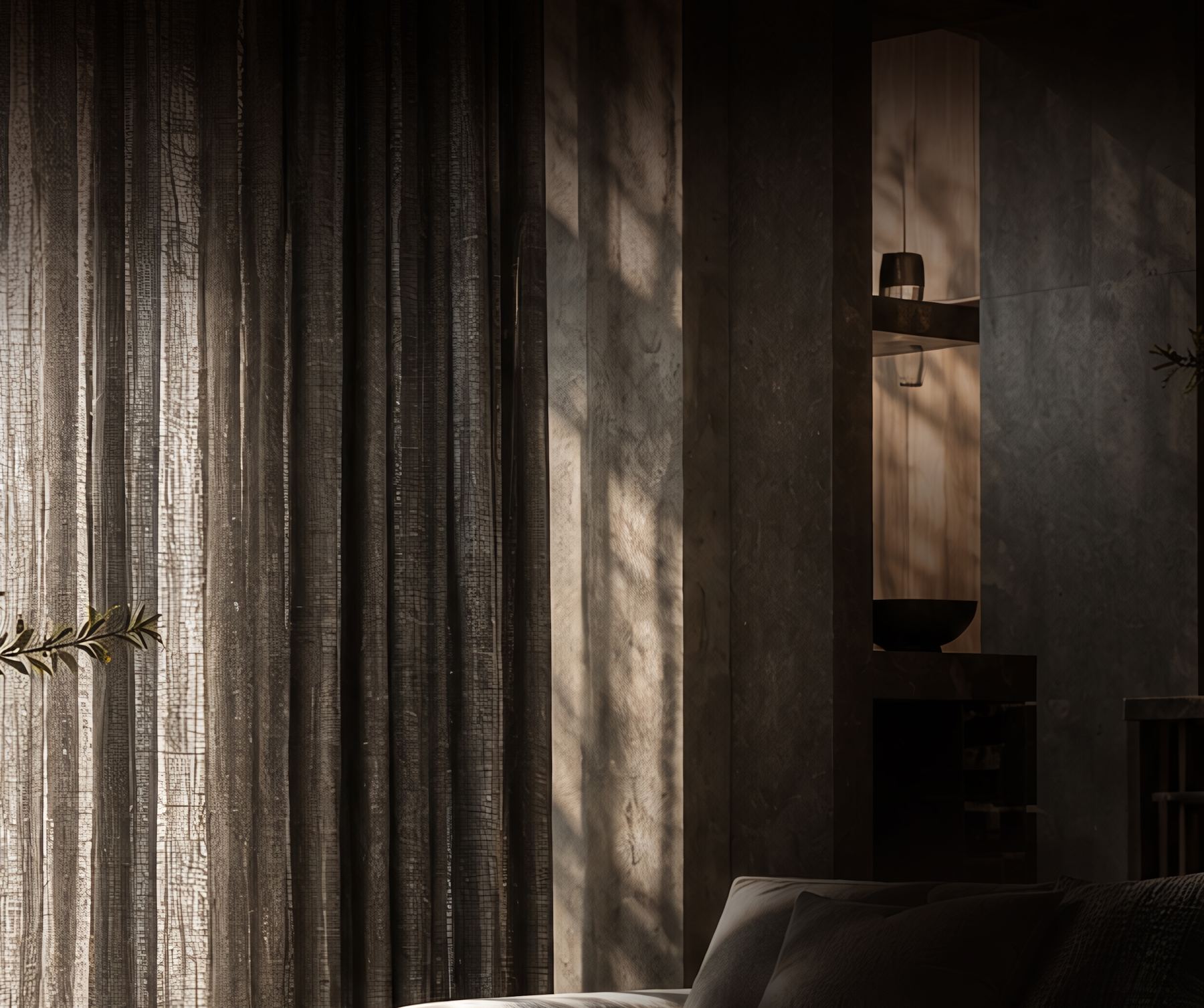
Where does light meet shadow?
Shade tones bring depth, contrast and a sense of structure. Use them to give a space more definition without introducing strong colour.
Catalogue 02
Quiet
Structured
Refined
Greys, silvers and charcoals create a more composed, architectural atmosphere. Use them when you want to add visual weight and contrast while keeping the room refined.
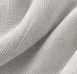 Silver
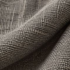 Grey
Grey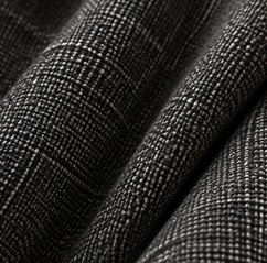 Charcoal
A palette where depth replaces colour.
Shade works through contrast, responding to light, materials, architecture and the darker elements already in the room.
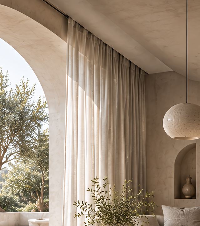
Greys introduce structure without making the room feel heavy.
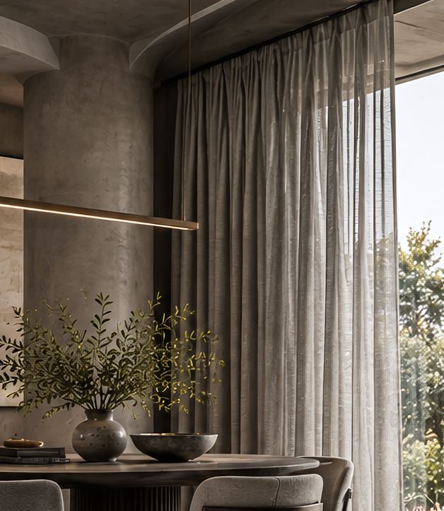
Mid greys create contrast while keeping the overall palette composed.
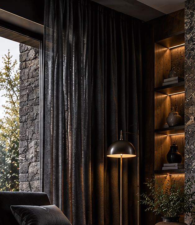
Deeper shades reinforce architectural elements and create a more grounded atmosphere.
The fabric changes everything around it. The same colour can feel softer, richer, quieter or more luminous.
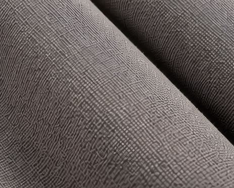
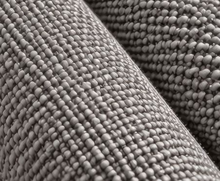
A matte finish absorbs light, keeping colour soft and understated. The result feels relaxed and natural.
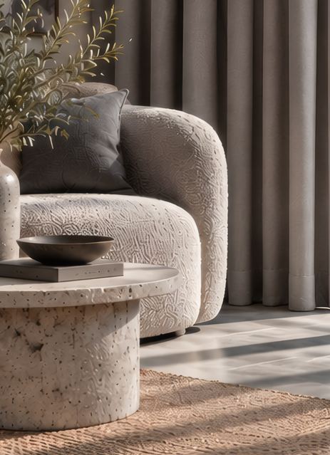 Quiet / grounded
Texture gives colour more depth. It catches light unevenly, making the same tone feel layered and tactile.
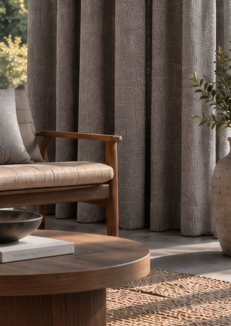 Natural / rich
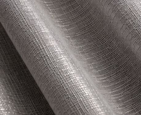
A subtle sheen catches the light, giving colour a gentle glow and a more polished feel.
 Luminous / refined
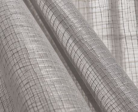
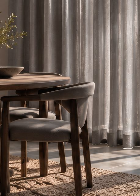
A sheer fabric lets light pass through the colour, making it feel lighter, softer and more delicate.
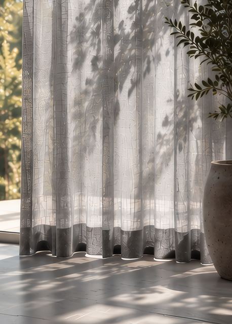 Delicate / airy
More depth.
Not more colour.
122 designs across 15 colours. Open a colour, then pick a design to see its details.
What makes a space feel like home?
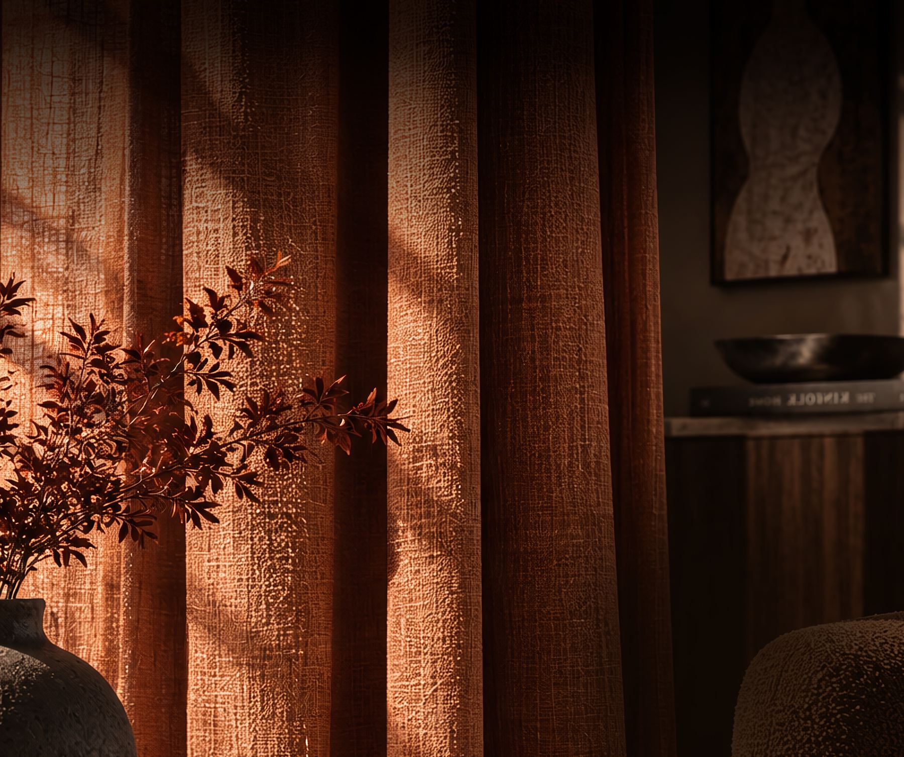
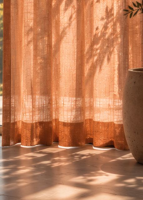
Warmth brings depth and a sense of luxury, making a space feel more layered, enveloping and personal.
Catalogue 03
Earthy
Rich
Intimate
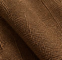
Browns, reds and pinks create a deeper, more enveloping atmosphere. Use them when you want a room to feel warm, intimate and considered.
 Brown
Brown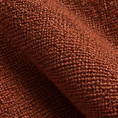 Red
Red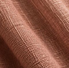 Pink
PinkA warmer space feels more layered. More luxurious.
Warmth works best when it picks up on the materials and colours already present: wood, stone, leather, metal and upholstery.
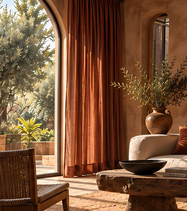
Browns and earthy reds reinforce natural materials and give the room more depth.
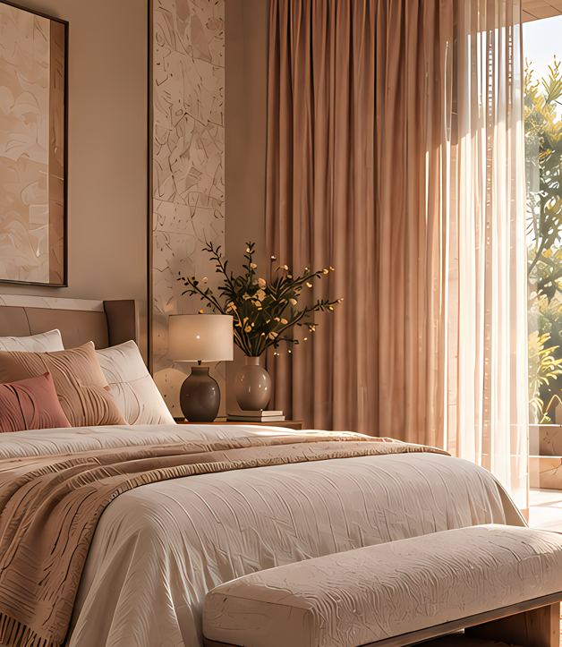
Warmer browns and muted pinks add colour without disrupting a quiet palette.
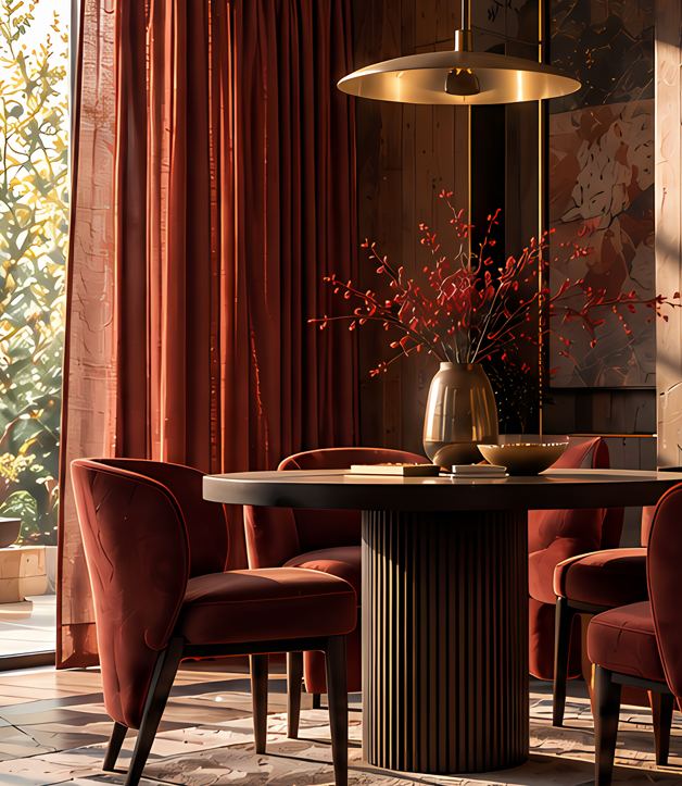
Deep reds and sophisticated pinks complement richer materials and create a more enveloping atmosphere.
The fabric changes everything around it. The same colour can feel softer, richer, quieter or more luminous.
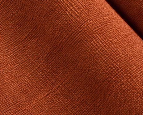
A matte finish absorbs light, keeping colour soft and understated. The result feels relaxed and natural.
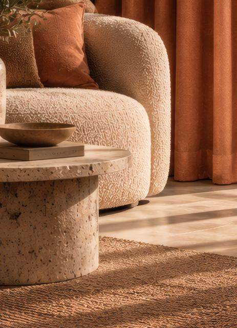 Quiet / grounded
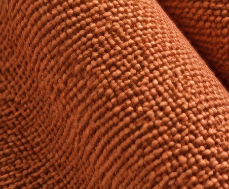
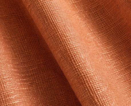
Texture gives colour more depth. It catches light unevenly, making the same tone feel layered and tactile.
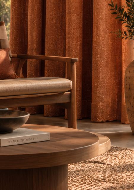 Natural / rich
A subtle sheen catches the light, giving colour a gentle glow and a more polished feel.
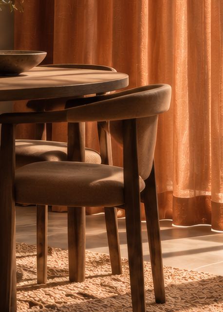 Luminous / refined
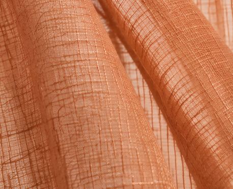
A sheer fabric lets light pass through the colour, making it feel lighter, softer and more delicate.
 Delicate / airy
Find the warmth.
Then build on it.
86 designs across 24 colours. Open a colour, then pick a design to see its details.
What makes a space feel alive?
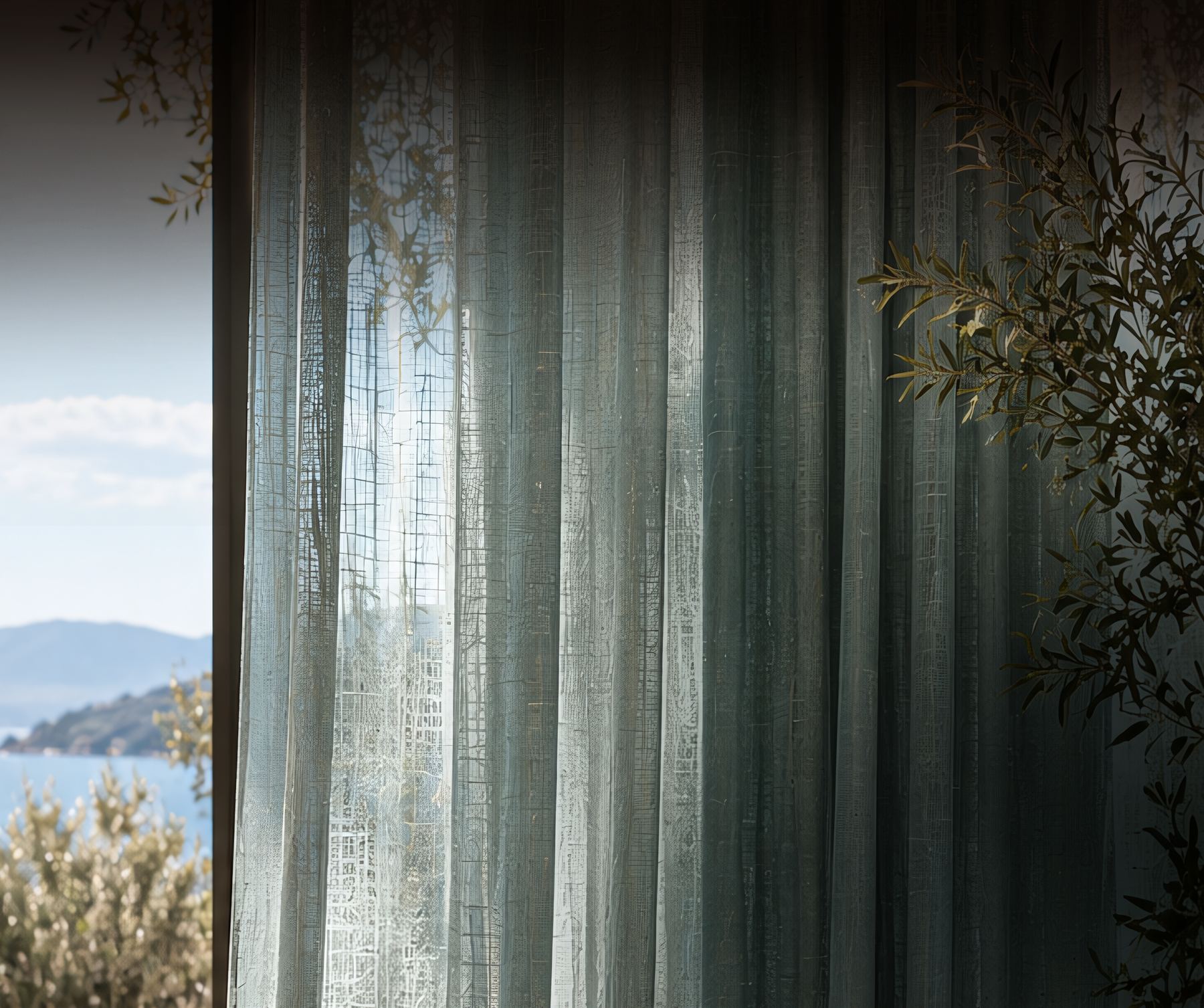
Cool tones bring freshness and a sense of quiet. Use them when you want a room to feel lighter and connected to the outdoors.
Catalogue 04
Fresh
Calm
Atmospheric
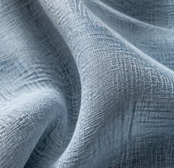
Blues, greens and purples create a cooler, more relaxed atmosphere. Use them when you want to introduce colour without making the room feel heavy.
 Blue
Blue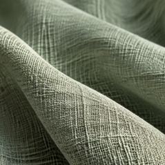 Green
Green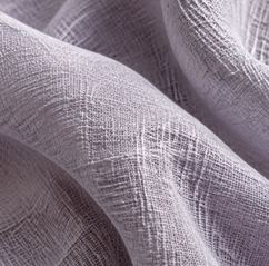 Purple
A palette that brings the outside in.
Cool tones work best when they connect with the light, views and natural elements already present in a space.
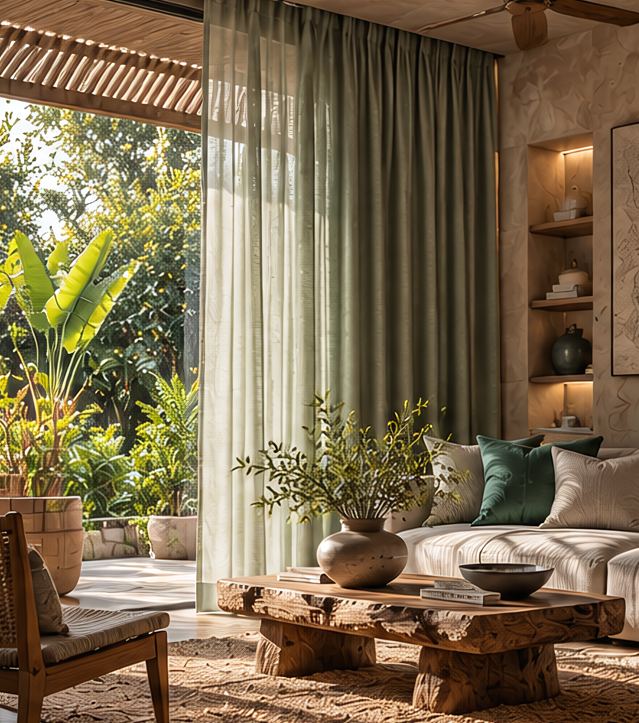
Greens create continuity between the interior and the landscape beyond.
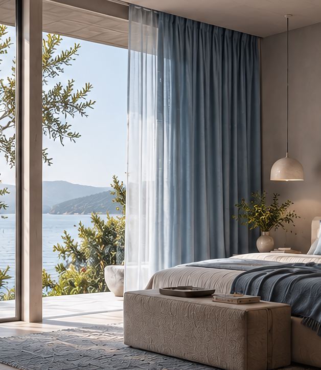
Blues bring a sense of air and openness without adding visual weight.
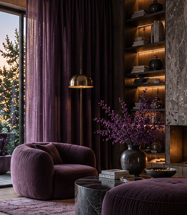
Deeper blues and purples introduce colour while keeping the space composed.
The fabric changes everything around it. The same colour can feel softer, richer, quieter or more luminous.
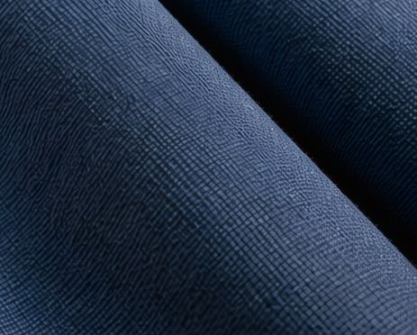
A matte finish absorbs light, keeping colour soft and understated. The result feels relaxed and natural.
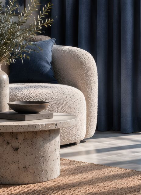 Quiet / grounded
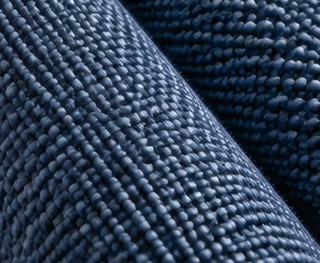
Texture gives colour more depth. It catches light unevenly, making the same tone feel layered and tactile.
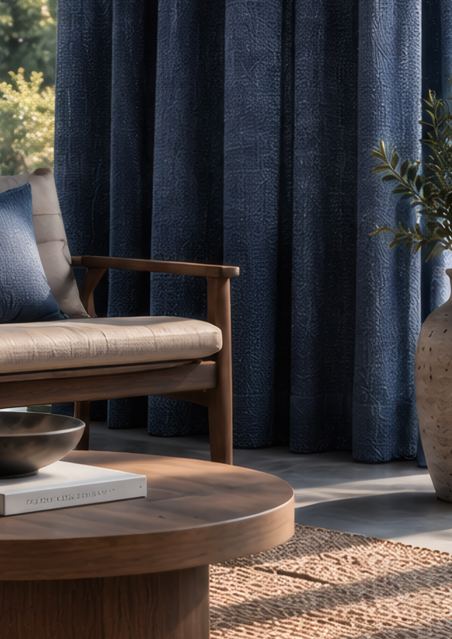 Natural / rich
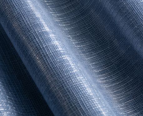
A subtle sheen catches the light, giving colour a gentle glow and a more polished feel.
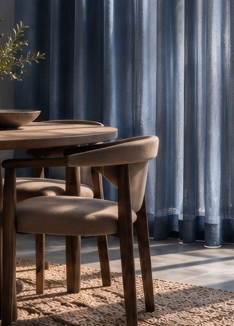 Luminous / refined

A sheer fabric lets light pass through the colour, making it feel lighter, softer and more delicate.
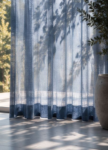 Delicate / airy
Look outside.
Then bring it in.
112 designs across 29 colours. Open a colour, then pick a design to see its details.